Brand guide · For graphics, video, slides and social
Look like
the website.
Everywhere.
For anyone making something with the Product of Experience name on it: slides, video, social posts or event graphics. Everything here matches this site.
00
The short version.
If you only read one part, read this. Everything else in the guide expands on these eight rules.
- 01Off-white paper
#F5F5F0and near-black ink#171717do most of the work. Colour is an event. - 02One typeface for words: Arial Bold, set big and tight. Monospace for small labels, captions and metadata.
- 03Headlines are short lines in sentence case, ending with a full stop.
- 04Highlight one phrase per headline with a lime block, tilted −2°.
- 05Square corners. 1px ink rules. Hard shadows with no blur, when you need a shadow at all.
- 06Real photos of real work, slightly tilted, always with a short mono caption.
- 07Blue gets white text. Lime, pink and orange get ink text. Nothing else.
- 08No gradients, icons, emoji, stock photos or rounded cards.
01
Wordmark.
The logo is set in type, not drawn. All lowercase, heavy, tightly spaced, with a coloured full stop. Stacked on two lines is the default. Use one line where height is tight.
experience.
experience.
experience.
Top: on paper, the full stop is blue #294DFF. Bottom: on ink or blue, the type goes white and the full stop goes lime. Extension · not yet on the site
Setting it
Arial, weight 900 (renders as Arial Bold or Arial Black depending on the app). Letter-spacing −4.8% (−48 in Figma/Keynote tracking units). Line height 93%.
Space and size
Keep clear space of at least one line height on every side. Smallest size is 16px on screen or 6mm in print. Below that, use the monogram.
Monogram
Lowercase “pe” in ink on a lime tile. Used as the favicon. Use it for avatars and app icons.
Keep it lowercase. Keep the full stop. Put it top-left on slides and graphics, the same place it sits on the site.
Capitalise it, recolour the letters, outline it, add a shadow, or use the old pink-on-navy “PE” logo. That logo is retired.
02
Colour.
Paper and ink carry the page. Lime is the signature accent. Blue, pink and orange are full-bleed blocks used one at a time. Click any hex value to copy it.
- HEX
- RGB
- 245 245 240
Background for almost everything.
- HEX
- RGB
- 23 23 23
Text, rules, buttons and closing frames. Use instead of pure black.
- HEX
- RGB
- 213 255 65
The highlighter. Marks, notes, the call to action on dark.
- HEX
- RGB
- 41 77 255
The full stop in the logo. Full-bleed section colour. Hover state.
- HEX
- RGB
- 246 167 207
Block colour for case studies and series.
- HEX
- RGB
- 255 155 85
Block colour for case studies and series.
- HEX
- RGB
- 233 233 226
Alternate band behind photos and the “about” section.
- HEX
- RGB
- 255 255 255
Text on blue and ink only. Never a background.
Rough proportions
One block colour per slide, frame or graphic. Pink and orange never sit next to each other except in a set of case-study tiles.
Text pairings (WCAG contrast)
These are screen colours. Lime and blue sit outside what CMYK can print, so they will dull on paper. For anything printed, ask the printer for a hard proof and match by eye to the hex values. Ask for a fluorescent or Pantone spot ink if the lime matters, which on a sign or a sticker it usually does.
03
Type.
One sans for everything you read, one monospace for everything you glance at. The character comes from size and spacing: very heavy, very tight, short lines.
Bring the
problem.
Something’s stuck.
You’re too busy to unstick it.
I help businesses keep customers, decide what to build next and get their teams moving in the same direction.
Customer experience · 20 years at BBC Sport
Fonts by app
| Where | Words | Labels |
|---|---|---|
| Keynote, Figma, Final Cut, Premiere (Mac) | Arial Bold / Arial Black, or Helvetica Neue Bold | Menlo |
| PowerPoint (Windows) | Arial Bold / Arial Black | Consolas |
| Google Slides | Arial | Roboto Mono (closest available) |
| Canva or anything without Arial | Arimo (Arial’s free twin, same widths) | DejaVu Sans Mono, or Roboto Mono |
Sizes for a 1920 × 1080 frame
| Role | Size | Weight | Tracking | Line height | Site equivalent |
|---|---|---|---|---|---|
| Hero headline | 150 px | 900 | −6.5% | 94% | h1, 70–118 px |
| Slide headline | 96 px | 700 | −5% | 104% | h2, 38–66 px |
| Sub-heading | 56 px | 700 | −4% | 110% | h3, 31 px |
| Intro / large body | 40 px | 400 | −2% | 145% | .intro, 23 px |
| Body | 32 px | 400 | 0 | 160% | p, 18 px |
| Label / caption | 26 px mono | 400 | +4%, caps | 150% | .label, 14 px |
For other canvas sizes, scale everything by the frame width. A 1080-wide square or portrait post uses about 56% of these values.
04
Graphic devices.
The site has no icons. Its personality comes from a handful of moves that look made by hand: highlighter, sticky notes, photos pinned at a slight angle. Use them sparingly, at most two per frame.
the answer.
Highlighter
Lime block behind one phrase, rotated −2°. Padding 0.08em sides. One per headline. Flat, never on body text.
 The person you’ll
be working with.
Pinned photo + note
Photo tilted +2°. A lime sticky note in mono, tilted −7°, overlapping the edge. Copy is plain and a little wry.
then disappear.”
Hard shadow
Offset 5–6 px down and right, solid ink, zero blur. Marks the selected or active thing. Never soft drop shadows.
Hairline rules
1 px ink lines separate rows and frame footers. Use rules and borders to group. Corners stay square.
Colour blocks
Solid fills with an ink border. Each client or series owns one colour so a set reads as a set.
lose customers.
Mono eyebrow
A small uppercase mono label above or below a heading gives it a category. Keep it to three or four words.
05
Photography.
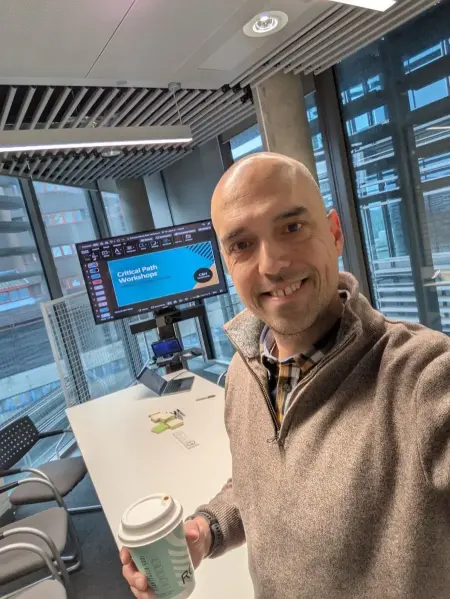
Real people doing the work: workshops, panels, conversations. Scott in the frame, ideally mid-sentence or mid-task. Phone photos are fine when the moment is real.
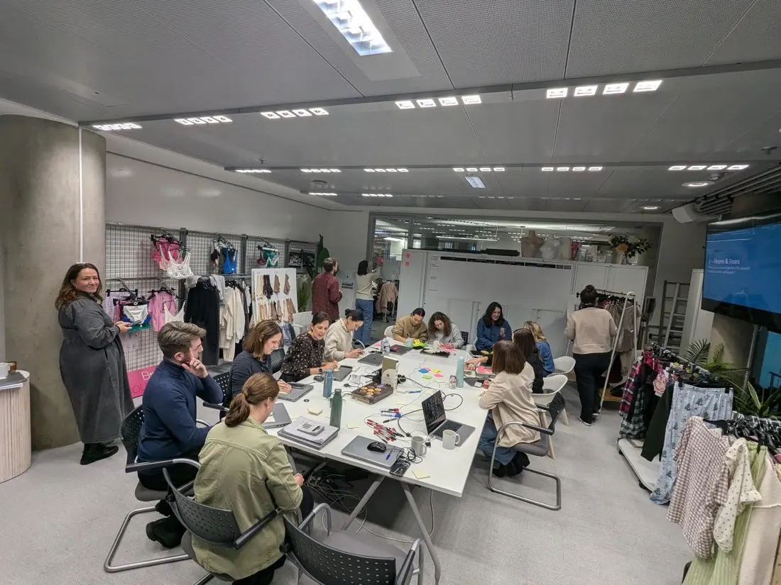
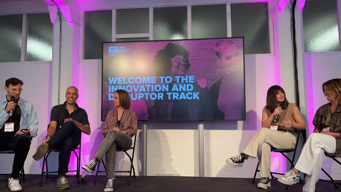
Pull saturation down about 10%. Tilt hero photos by 1.5–2°. Give every photo a one-line mono caption that says something a person would say.
Use stock or AI-generated people, duotones, colour overlays or gradient fades. Never crop Scott out of a photo of him working.
06
Presentations.
Build at 1920 × 1080. Margins are 5% of the width (96 px). The wordmark sits top-left on title and closing slides. Six layouts cover almost every talk and pitch.
experience.
Bring the
problem.
Let’s build
the answer.
A · Title. Paper, display headline, pinned photo, mono footer on a rule.
Follow the customer. Find out where they stop coming back.
B · Statement. One sentence, one highlight. The workhorse slide.
Work out
what to build next.
C · Section divider. One block colour per section, used consistently through the deck.
6 weeks
From kick-off to launch for an AI career copilot.
D · Stat. One number, huge, with one line of context underneath.
This work starts with people.
Working it out together. 08E · Image. Photo on stone, tilted, with a heading and a mono caption beside it.
experience.
What’s been sitting
on your desk
too long?
hello@productofexperience.com
F · Close. Ink background, last phrase in lime, email in mono.
07
Video.
The same parts, moving. Graphics are flat blocks of colour that cut or slide on. Keep everything inside a 5% safe area so platforms’ own buttons don’t cover it.
Lower third. Name in white on an ink bar, role in mono on lime. Bottom-left, inside the safe area.
Burnt-in captions. Arial Bold, white on an ink box, sentence case. Lime only on the one word that matters, a few times per video.
A spreadsheet audit
people could finish.
Title card. Solid block colour, mono eyebrow, display headline anchored bottom-left. Hold 2–3 s.
experience.
Bring the problem. Let’s build the answer.
End card. Wordmark large on paper, the line, then the URL on the footer rule. Hold 3 s.
Motion
Hard cuts between shots. Graphics slide in over 0.25 s with a fast ease-out, or appear on a cut. The highlighter wipes left to right, then settles at −2°.
Avoid
Bounces, spins, glows, blurs, particle effects, kinetic-type montages and anything that pulses. If it looks like a template pack, cut it.
Formats
16:9 at 1920 × 1080 for YouTube and the site. 9:16 at 1080 × 1920 for Reels and Shorts. 4:5 at 1080 × 1350 for LinkedIn feed. Always ship a .vtt caption file too.
09
Words on screen.
Graphics carry very few words, so each one counts. Write as Scott, in the first person, the way he would say it across a table.
- Short claims that end in a full stop.
- Concrete: numbers, clients, timeframes.
- Plain verbs: fix, build, decide, test.
- Break headlines where you would pause.
- Em-dashes holding sentences together.
- Triads like “faster, smarter, simpler”.
- “It’s not X, it’s Y.”
- Actually, genuinely, quietly, seamlessly, effortlessly.
- “Empowering teams to unlock growth.”
10
Tokens.
These are the values this site is built with. Paste them into a design tool, a slide theme or a motion project to start from the same values.
/* Product of Experience · colour */
--paper:  #F5F5F0;   /* background */
--ink:    #171717;   /* text, rules, buttons */
--lime:   #D5FF41;   /* highlighter, notes, CTA on dark */
--blue:   #294DFF;   /* logo full stop, block, hover */
--pink:   #F6A7CF;   /* block */
--orange: #FF9B55;   /* block */
--stone:  #E9E9E2;   /* alternate band */

/* type */
--sans: Arial, Helvetica, Arimo, sans-serif;
--mono: Menlo, Consolas, "DejaVu Sans Mono", monospace;
display: 900 · tracking -0.065em · line-height 0.94
heading: 700 · tracking -0.05em  · line-height 1.04
body:    400 · tracking 0        · line-height 1.6
label:   mono 400 · uppercase · tracking 0.04em

/* shape */
radius: 0 · rule: 1px ink · shadow: 5px 5px 0 ink
mark: lime bg · rotate -2deg · note: rotate -7deg · photo: rotate 2deg
08
Social.
Same rules on a smaller canvas. Every post should be recognisable as PoE with the name covered up.
Nobody reads the onboarding email.
Quote card · 1200 × 1200
115
audit points rebuilt around how hospice teams work day to day.
Stat card · 1200 × 1200
Need the logo, photos or a template file? Email hello@productofexperience.com.